In which I discover there are apparently 47 shades of Victorian green, none of them are right, and B&Q consider legal action.
The Inheritance
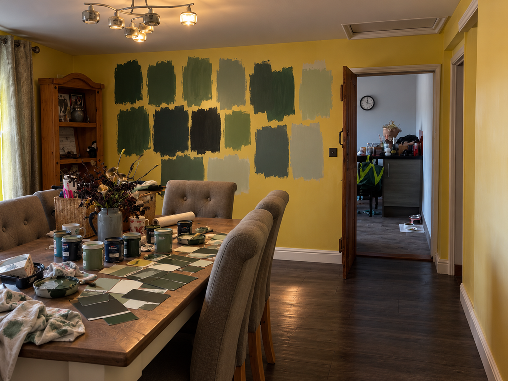
When we last left the dining room, it was aggressively yellow, the corner shelves were being held together with cable ties, and I had plans.
Big plans.
Before any of those plans could begin, however, there was the small matter of furniture….Enter Mumsy.
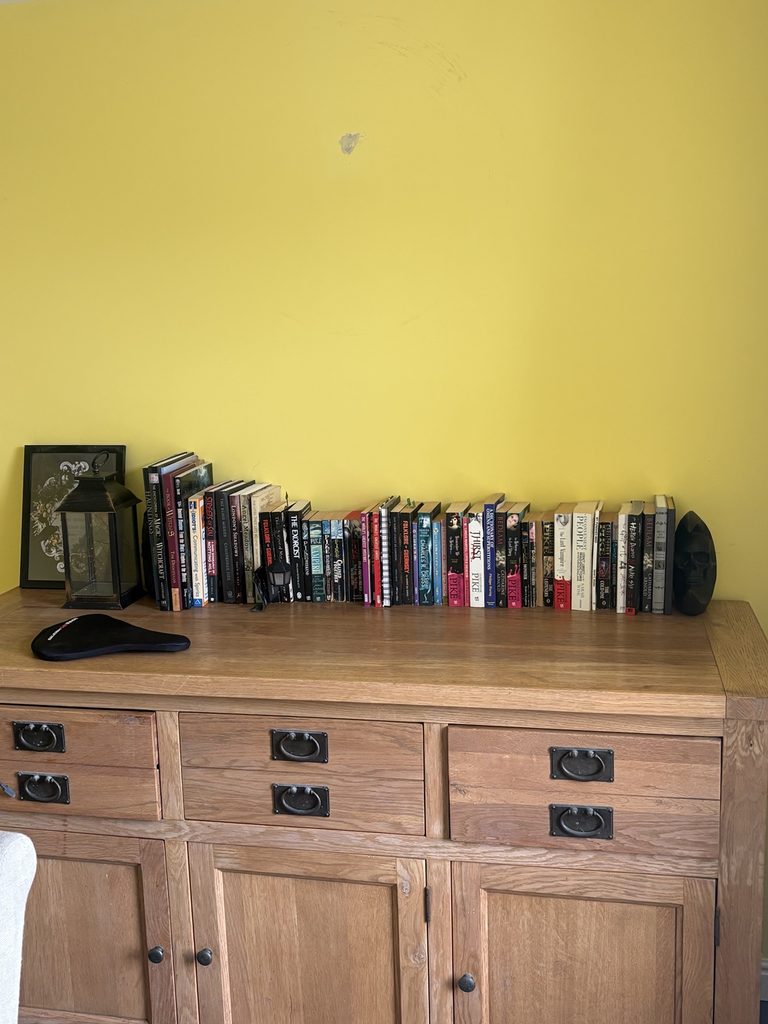
My mum had been faithfully storing a large oak side cabinet in her conservatory, apparently waiting for the glorious day when I finally owned a house big enough to rehome it.
Or, translated from Mum: she didn’t want it anymore, it took up too much space, but it was “too good to get rid of.”
Thankfully, Everstead is considerably more accommodating than any of my previous houses, so the great ceremonial passing of the sideboard could finally take place.
As a side note, this is largely how the first two properties I owned ended up semi-furnished too. Mum has never met a perfectly serviceable piece of furniture she could actually get rid of when she has a daughter with an address.
Thanks, Mumsy.
And actually, the cabinet was perfect. Big, solid, properly wooden and exactly the sort of thing I wanted in there.
Now all I had to do was transform the migraine-yellow room around it into the dark, sumptuous, vaguely Victorian dining room I had in my head.
Easy.
The Green That Was Definitely The Green
I knew exactly what colour I wanted.
Green.
Not just any green, obviously. A dark, sumptuous, Victorian green. Moody without being gloomy. Dramatic without making the room look like a cave. The sort of green that would make Mumsy’s enormous oak cabinet look intentional rather than like she’d finally managed to clear out her conservatory.
And I found it.
The Green.
I was absolutely certain. This was exactly the colour I’d had in my head.
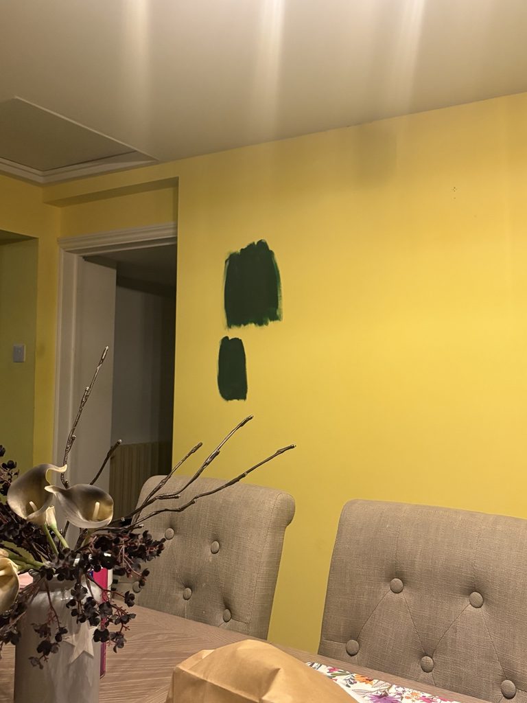
So I painted a decent-sized chunk of it onto the main wall.
It was not The Green.
No matter. Back to B&Q.
I found another one.
This was The Green.
Another sizeable patch went up beside the first.
It was also not The Green.
What followed were another six or seven shades, because apparently I don’t believe in those sensible little tester squares normal people paint discreetly behind a door. I needed large areas of evidence.
Before long, the main dining-room wall looked like some sort of Victorian-green police line-up, with each suspect having briefly been identified as The One before being eliminated from enquiries.
By 24th August, I had apparently developed a part-time career in paint selection and was somewhere around shade 47 of “dark, sumptuous Victorian green.”
At this point B&Q really should have put me on the rota.
And I was still convinced that the problem was simply that I hadn’t found the right green yet.
Reader, the green was not the problem.
In Theory, This Was Going Brilliantly
There was another reason I was so convinced one of these greens had to work.
I had technology on my side.
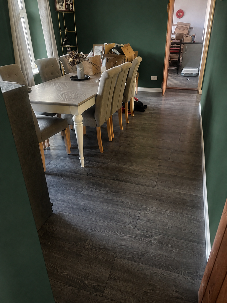
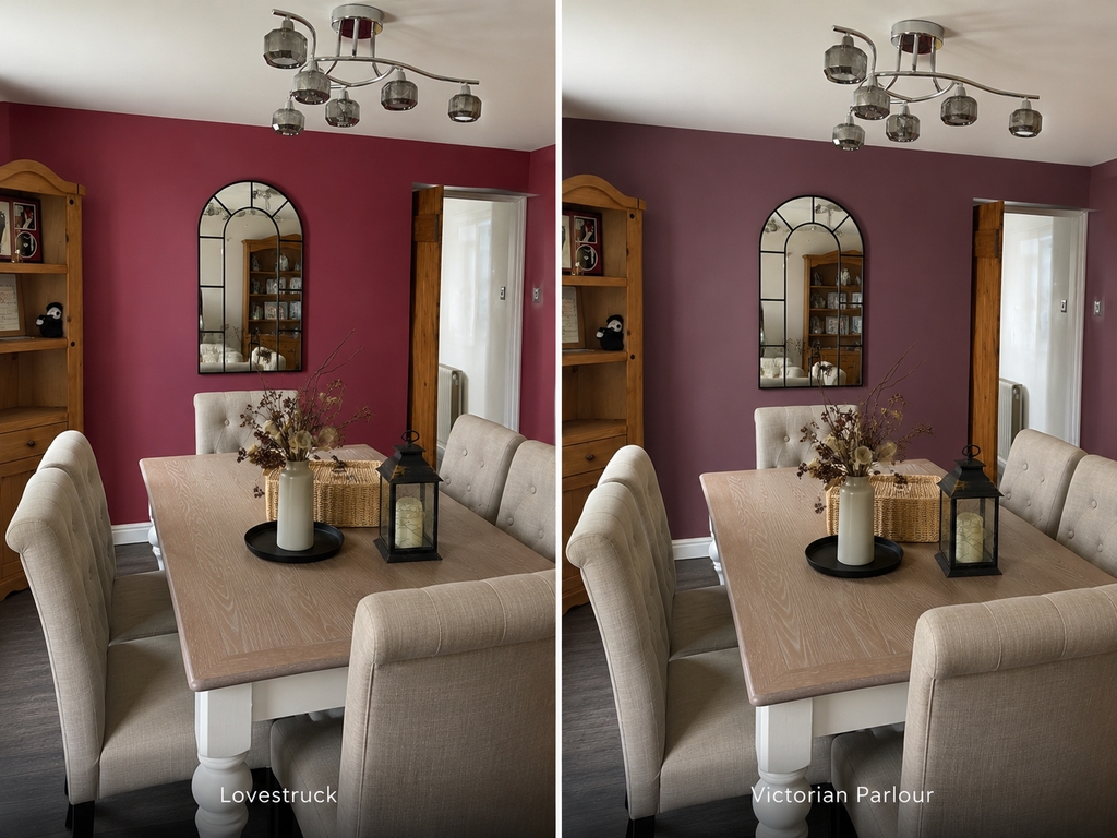
Before committing to each new contender, I’d enlisted my long-suffering AI accomplice, Clarence, to mock up my actual dining room in various shades of dark Victorian green.
And every single bloody one looked perfect.
Deep green? Gorgeous.
Slightly darker green? Even better.
Moody, almost-black green?
THERE. THAT’S IT. THAT’S THE ONE.
In theory, Clarence and I had successfully decorated the dining room several times over.
So why, when I put these supposedly perfect colours onto the actual wall, did every single one immediately become wrong?
I had photographic evidence. I had artificial intelligence. I had approximately half the paint department at B&Q.
What more did this room want from me?
Apparently, daylight.
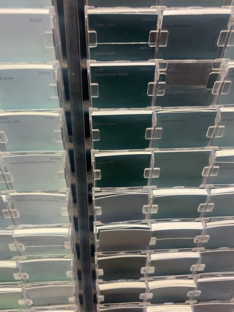
Apparently I Have Designed a Cave
For several days I lived with my Victorian-green police line-up, wandering past it at different times of day and staring at the wall as though one of the shades might eventually crack under questioning.
During the day, I still loved the idea.
Then the evenings started drawing in.
Suddenly all those rich, sumptuous, beautifully moody greens I’d spent weeks obsessing over started looking rather less Victorian manor house and rather more underground drinking establishment where no natural light has penetrated since 1847.
There was also the small matter of the room itself. It’s a big room, but it doesn’t get masses of natural light, and apparently painting the walls the colour of a particularly dense forest wasn’t going to improve matters.
I began to have doubts.
Not little perhaps I’ll go one shade lighter doubts.
Full ABORT THE ENTIRE GREEN PLAN doubts.
Which, after approximately seven tester pots, several large patches of wall and enough visits to B&Q that I was practically entitled to staff discount, was excellent timing.
So naturally, having spent weeks trying to find the perfect green, I did the only sensible thing.
I started looking at red.
And actually, I had logic.
The kitchen already had bright red running through it. The lounge was heading firmly into moody oxblood territory. The dining room sits between the two, so suddenly red wasn’t just another colour I’d become temporarily obsessed with.
Red would make the whole stretch cohesive.
Obviously.
The kitchen would be the brighter end, the lounge dark and moody, and the dining room would sit beautifully between them in some sort of rich Victorian wine, claret, oxblood situation.
It made perfect sense.
In fact, within approximately twelve minutes, I’d convinced myself this had probably been the plan all along.
Perfect.
Green had merely been an unfortunate seven-tester-pot-long administrative error.
The Red Era
So off I went again.
This time, we were looking for red.
Not red red, obviously. Nothing that screamed postbox or primary-school paint tray. I wanted something deep, rich and suitably Victorian. Something that would bridge the brighter reds in the kitchen with the moody oxblood of the lounge and prove that this latest change of direction was, in fact, an entirely deliberate interior-design decision.
We tried red.
Then claret.
Then oxblood.
Then another red that was definitely going to be The One.
And, for reasons I can no longer adequately explain, one violently bright pink that had absolutely no business being in the line-up.
I don’t know what happened there.
Presumably by this point I’d looked at so many paint cards that I’d temporarily lost the ability to perceive colour.
And yet, once again, nothing worked.
The green police line-up had now been joined by an entire red-light district, plus one rogue Barbie who appeared to have wandered in from another investigation.
And every single one looked wrong.
At this point I was beginning to question everything.
My taste.
My eyesight.
Clarence’s credentials.
The entire visible colour spectrum.
And then I realised.
It wasn’t the green.
It wasn’t the red.
It wasn’t even the rogue pink.
It was the bloody yellow.
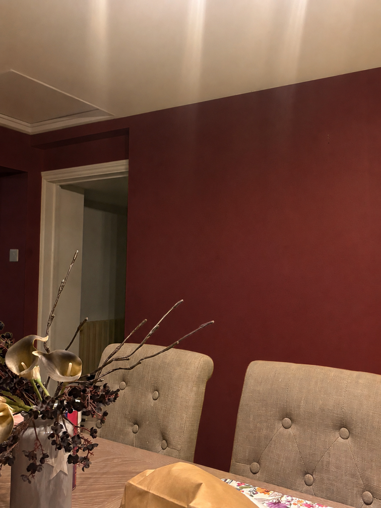
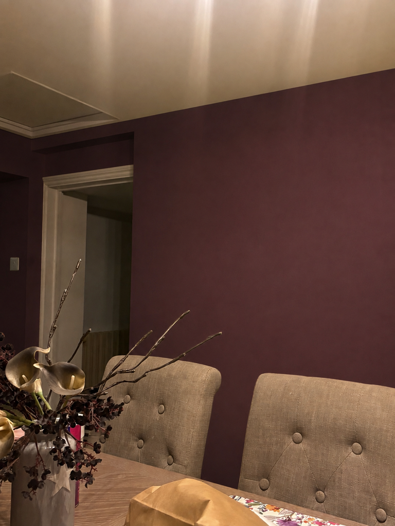
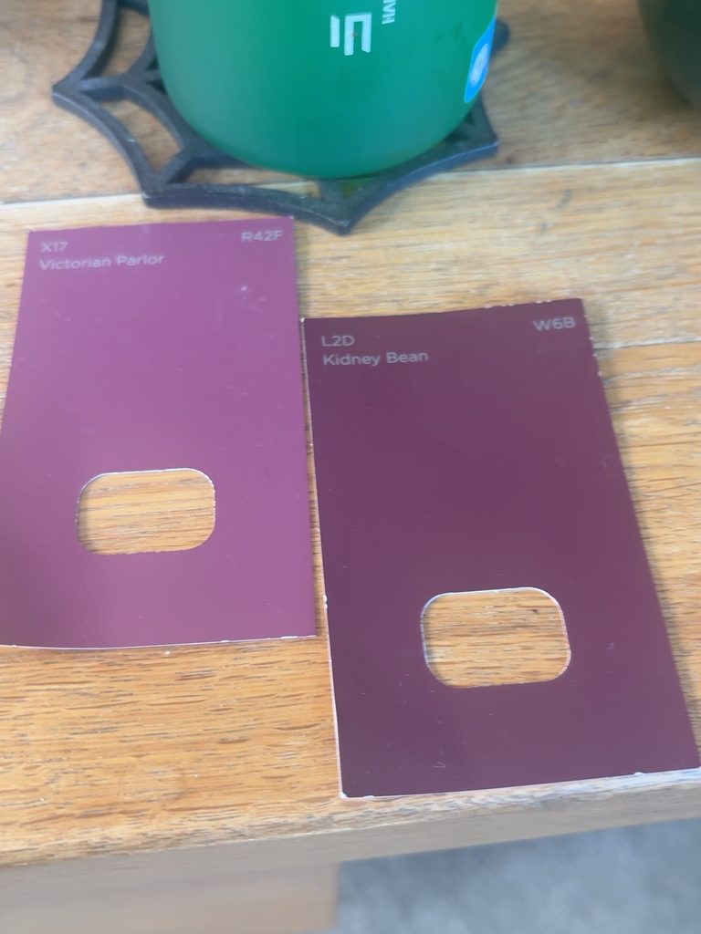
The Actual Culprit
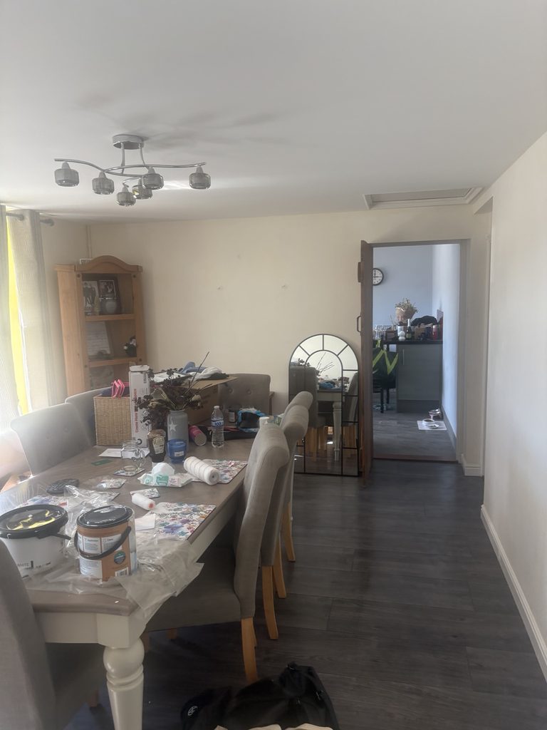
That demented daffodil yellow wasn’t merely sitting there being offensive.
It was actively sabotaging the investigation.
The beautiful deep greens I’d chosen were turning blue against it. The rich reds, clarets and oxbloods were becoming muddy, brown and generally reminiscent of something you’d find at the bottom of a Victorian drain.
No wonder nothing looked like the mock-ups.
We had been auditioning colours against several square metres of weaponised sunshine and then blaming the colours when they failed.
Suddenly, I had hope again.
Maybe I did have taste.
Maybe Clarence did know what he was doing.
Maybe one of the approximately fourteen colours currently decorating random sections of my wall had actually been perfect all along.
There was only one way to find out.
The yellow had to die.
All of it.
So I went out, bought a giant value tub of white paint and set to work.
This wasn’t decorating anymore. There was no carefully considered shade, no mood board, no Clarence mock-up. I wasn’t interested in undertones, heritage palettes or whether the white leaned warm or cool.
I just needed something, anything, between my prospective Victorian dining room and that demented yellow.
So I painted.
And painted.
And painted.
And discovered that apparently the yellow wasn’t going quietly.
Even under white paint it fought back, glowing through in patches like a demon with a paintbrush.
At this point it had become personal.
I wasn’t even sure what colour the dining room was going to end up anymore.
But it wasn’t going to be fucking yellow.
The Exorcism of the Yellow
The value white had done its best, bless it, but the yellow was still there.
Lurking.
Glowing.
Waiting for me to turn my back so it could make another perfectly respectable shade of green look inexplicably blue.
So, right.
Back to B&Q.
Assuming, of course, I wasn’t already the respondent of some sort of paint-department restraining order.
By this point I imagine the staff had started drawing straws when they saw me coming.
She’s back.
Don’t make eye contact.
For God’s sake, nobody show her the heritage range.
But this time I wasn’t messing around.
I found the thickest, most industrial-looking, yellow-defeating primer I could get my hands on.
I didn’t care about finish. I didn’t care about coverage per litre. I didn’t care whether it was technically excessive for the job.
I wanted something capable of sealing that yellow beneath the surface for future archaeologists to discover.
If B&Q had sold primer specifically labelled FOR COLOURS THAT HAVE WRONGED YOU PERSONALLY, I’d have bought two tins.
Back at Everstead, on it went.
And finally, slowly, gloriously…
the yellow disappeared.
We had won.
And after everything I’d been through, I was finally standing in front of a blank, neutral canvas ready to choose the perfect colour for my dark, sumptuous Victorian dining room.
So naturally…
I left it like that for weeks.
I Am No Longer Decorating. I Am Seeking Peace.
By mid-September, I’d had enough.
The Victorian green dream was dead. The reds had been dismissed. The rogue pink had been escorted from the premises and I’d spent far too much of my life thinking about paint.
I didn’t want sumptuous.
I didn’t want dramatic.
I didn’t want to hear the words undertone, heritage or colour palette ever again.
I wanted grey.
Plain, inoffensive, absolutely-not-yellow grey.
Of course, being me, I couldn’t simply walk into B&Q and buy a grey.
That would be ridiculous.
We tried another six.
Because apparently even at the very brink of paint-related psychological collapse, I still had standards.
Eventually, we settled on GoodHome Whistler.
Was it the dramatic Victorian colour I’d imagined when this whole thing began?
No.
Was it green?
No.
Was it red?
Also no.
Was it going to turn blue, become Victorian-drain brown or unexpectedly reveal itself to be Barbie pink?
Hopefully fucking not.
Decision made.
Paint bought.
And then, having finally settled the matter once and for all…
we did absolutely nothing with it for another couple of weeks.
Progress. Technically.
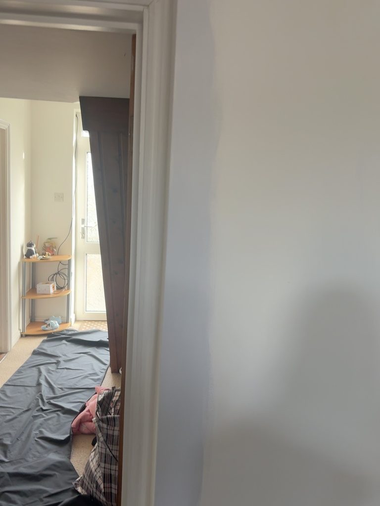
Eventually, on a random Friday afternoon we decided it was time.
The paint had been sitting there patiently waiting for us. The yellow was safely entombed. The colour had been chosen.
There were literally no more decisions left to make.
So we got the rollers out, opened the Whistler and finally started painting the dining room.
We painted half of it.
Not because we wanted to see how it dried.
Not because we were checking it in different lights.
Not because there was some complicated decorating reason why stopping halfway was actually very sensible.
It was Friday night and, quite frankly, we couldn’t be arsed to do the other half.
So, after weeks of indecision, approximately fourteen thousand tester pots, several existential crises and enough visits to B&Q that I’m surprised they haven’t named an aisle after me, the grand transformation of Everstead’s dining room was finally underway.
Half of it was grey.
The other half could wait.
UPDATE: 12.10.26
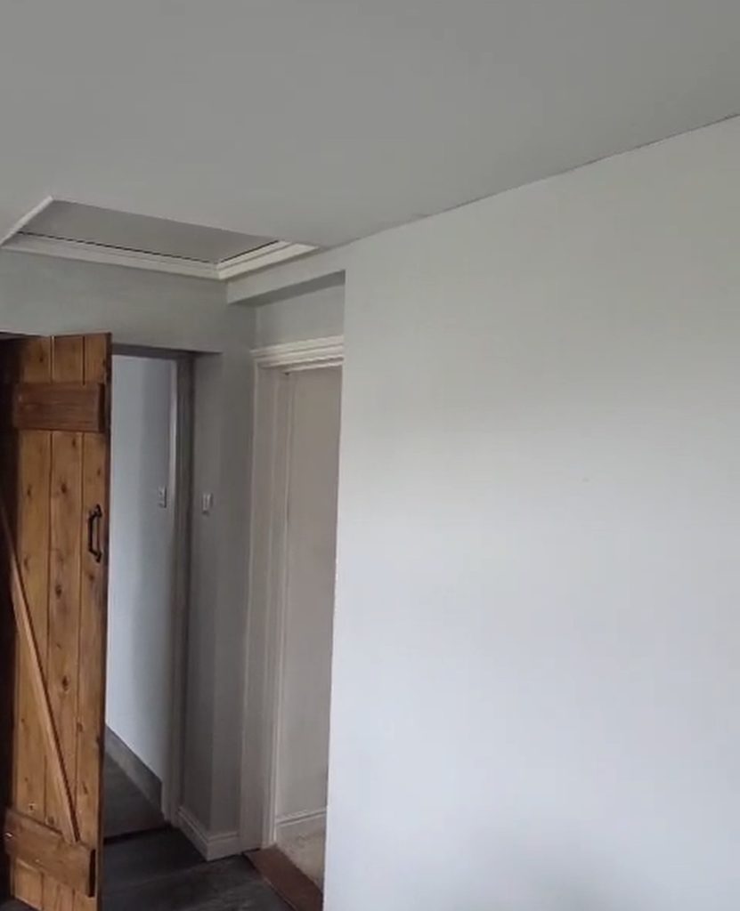
While I was busy documenting our spectacular lack of progress, Joel quietly went and painted the rest of the dining room.
Bless him.
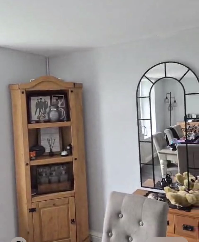
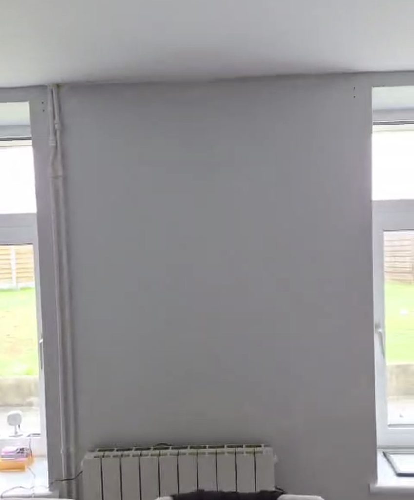
We officially have one whole grey room.
We officially have one whole grey room.
And actually? After everything this room put me through, I really bloody like it.
Now I can finally get on with the important bit: filling it with furniture, questionable antiques and things that may or may not be haunted.
Please nobody mention Victorian green for a while!!

Leave a Reply